 |
| General Principles |
 |
 |
 |
You should not have to train people on how to use your web site. It should be obvious and intuitive to the user. |
 |
 |
 |
If users cannot figure out how to use a feature on your web site, it is probably better if it does not exist. |
 |
 |
 |
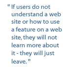
If users do not understand a web page or a web site, they will not learn more about it - they will just leave. |
 |
 |
 |
Do not steer away from certain standard interfaces and concepts that people are already familiar with on the web. There are certain expectations from the user that things should appear a certain way, based on their past experiences on other web sites. For example: |
 |
 |
 |
A. Online Forms - In the case of online forms, a checked box means yes and an unchecked box means no.
B. Scrolling - Horizontal scrolling is not OK. People scroll vertically. |
 |
 |
 |
Allow users to immediately see the results of their actions. For example when a user submits an online form, be sure to provide and notify them with a confirmation. |
 |
 |
 |
Provide the user with appropriate contact information in the event of errors, mistakes, problems, concerns and suggestions. |
 |
 |
 |
Do not make extremely important information look like advertisement. People will ignore it. |
 |

